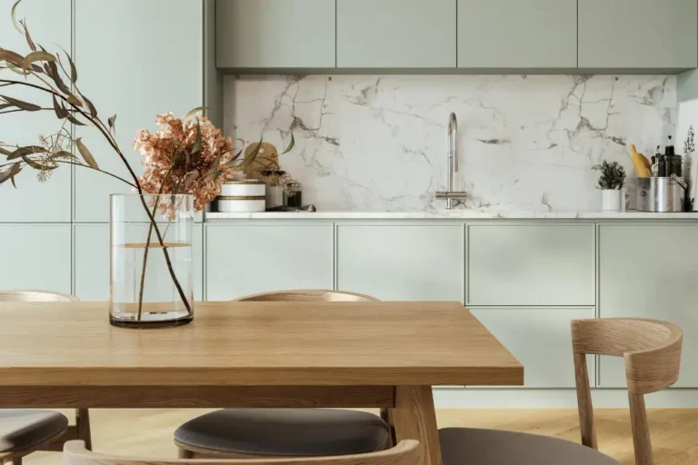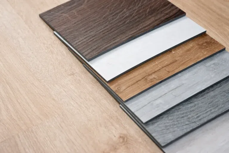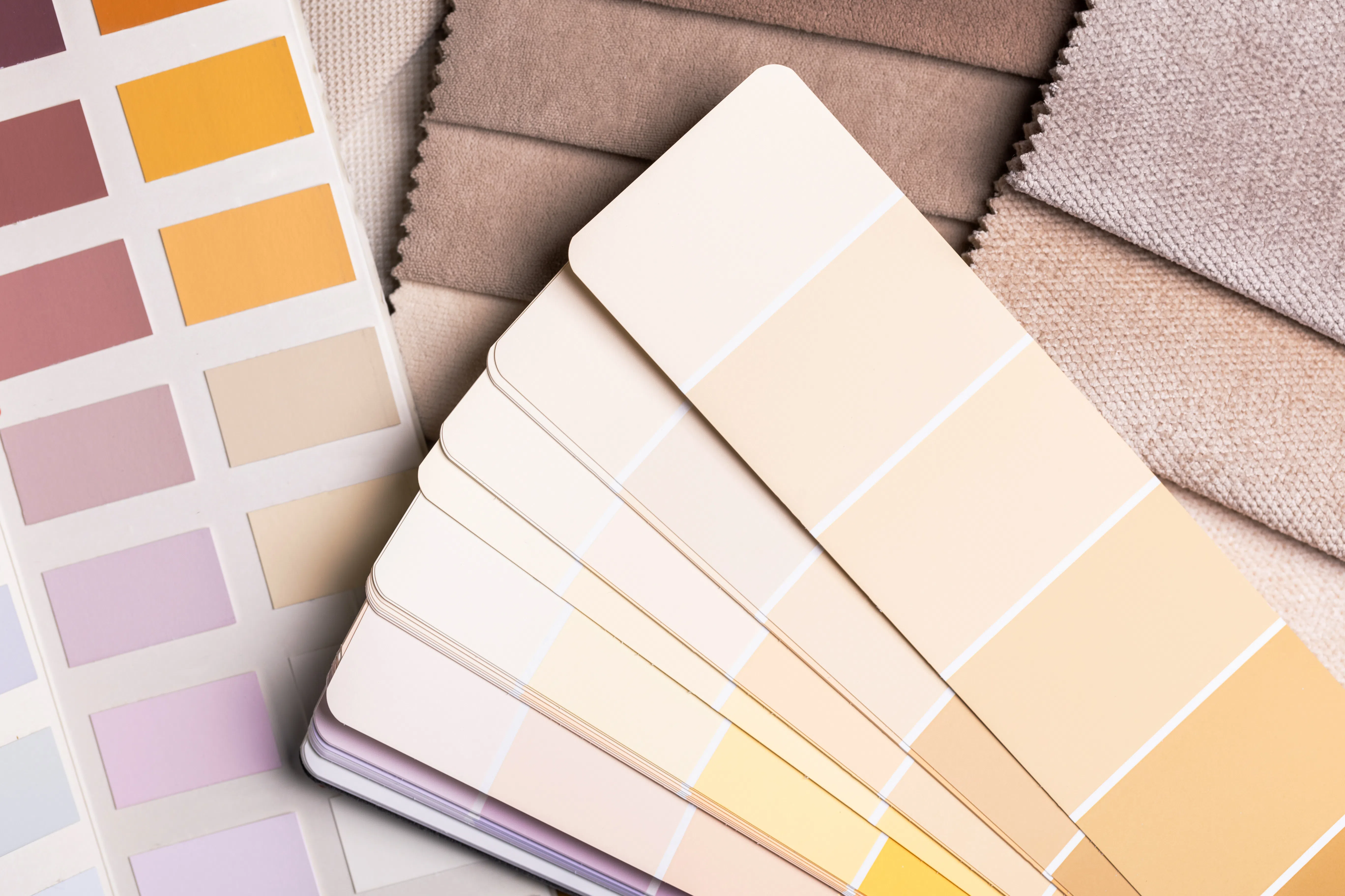
The 2026 wall color trends clearly show that interior design is placing an increasing emphasis on naturalness, a comfortable, homey atmosphere, and timeless elegance. Wall colors are not just decorative elements, but deliberate tools for setting the mood, capable of bringing freshness, tranquility, or even a distinctive depth to a space.

In this blog post, we’ll showcase the most versatile wall color trends for 2026 and, from an interior designer’s perspective, examine which shades work best with which interiors. These tips can help you create harmony even when using bolder colors.
What makes the 2026 interior design color trends special?
One of the most important characteristics of the interior design color trends set to emerge in 2026 is understated luxury and a cozy atmosphere. Contrary to what one might think at first glance, the emphasis is not on bold colors, but on tones that lend the space real character and a warm, cozy atmosphere.
The 2026 color palette draws inspiration from nature, earth tones, and timeless shades. These trends complement the for different styles, whether it's modern minimalism, a vintage vibe, or even an Art Deco interior.
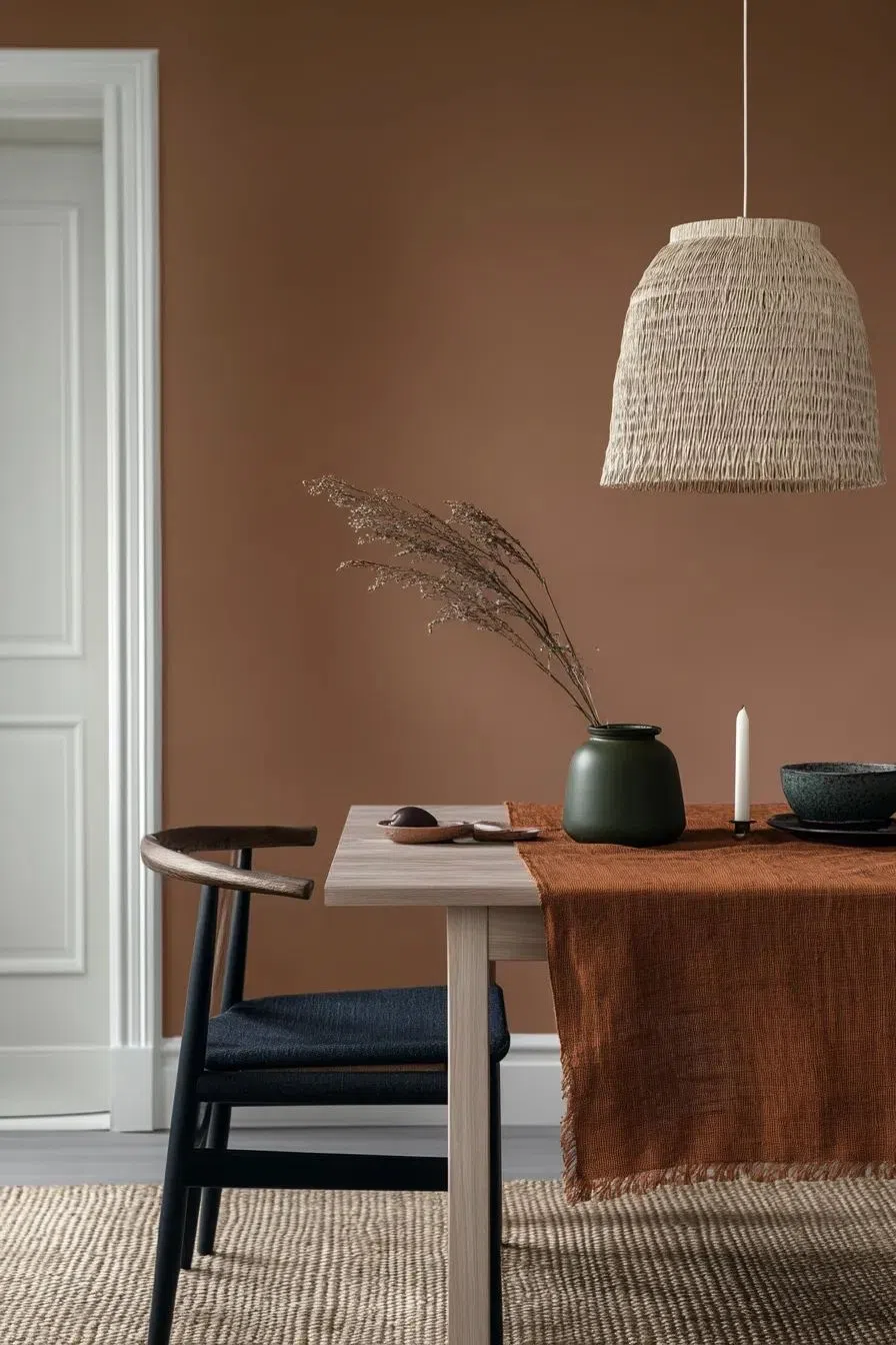
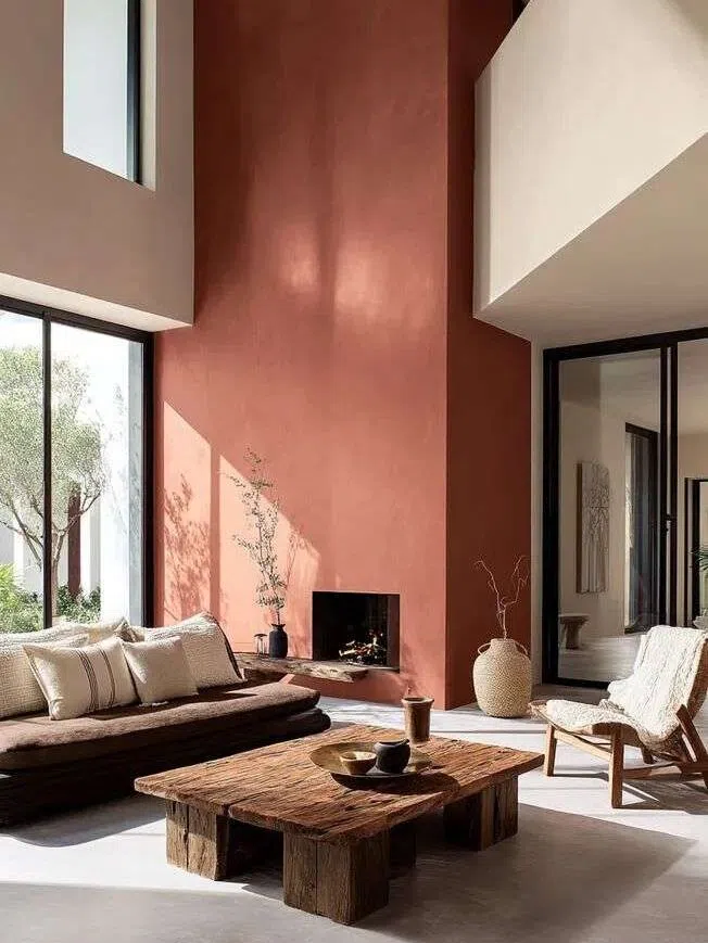
Terracotta and Clay: Versatile, Warm Shades
Shades inspired by terracotta and clay are among the most defining wall color trends of 2026. These tones belong to the earth tones family and pair particularly well with natural materials such as wood, stone, or natural textiles.
This wall color radiates warmth and a natural feel. It’s a cozy, rich, and energetic shade that pairs perfectly with Japandi, bohemian, industrial, and even Asian-inspired spaces.
Tried-and-true wall paint codes:
Benjamin Moore | Masada AF-220
Farrow & Ball | Red Earth 64
Trilak | Honey Graham PPG1069-5
Burgundy and Bordeaux: The Big Comeback of 2026
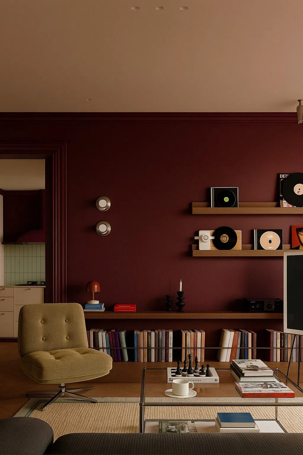
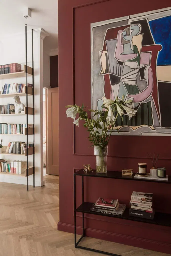
Shades of burgundy and Bordeaux will be back in the spotlight in 2026. These deep, rich tones bring true elegance and a sense of exclusivity and luxury to any space.
Burgundy isn’t too loud when paired with the right lighting and matching accessories. A well-chosen shade can work wonderfully in a home office or an elegant living room. It’s an excellent choice for Art Deco, classic, and even industrial interiors.
Tried-and-true wall paint codes:
Farrow & Ball | Preference Red 297
Benjamin Moore | Dinner Party AF-300
Trilak | Red Lentil PPG1059-7
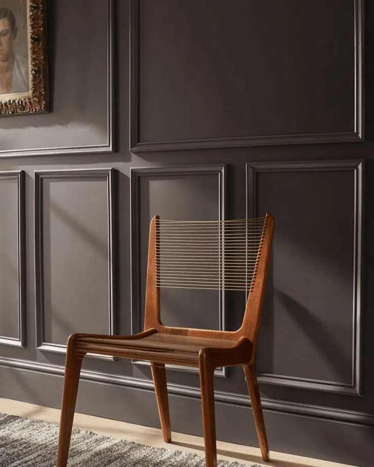
Dark grayish-brown: almost the color of 2026
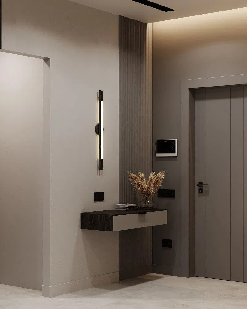
Dark grayish-brown is one of the most timeless shades, having just missed the podium in 2026. This shade creates a soothing, cozy atmosphere, while also being a bold and distinctive choice.
Neutral colors and the olive green . It pairs exceptionally well with elegant, classic, and “quiet luxury” styles. In fact, it also fits perfectly with the rustic farmhouse style, for example.
Tried-and-true wall paint codes:
Benjamin Moore | Silhouette AF-655
Farrow & Ball | London Clay 244
Trilak | Deconstruction PPG1006-6
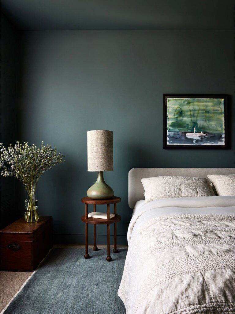
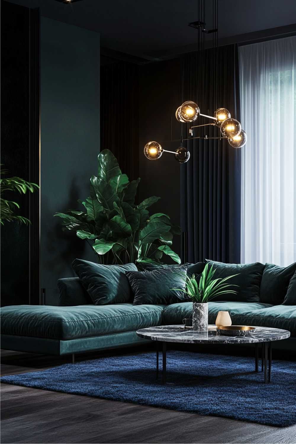
Dark greenish-blue: the queen of green shades
Dark greenish-blue shades are becoming increasingly prominent in interior design. This hue evokes both nature and the tranquility of water, while also creating a distinctive look.
It’s the ideal choice for bedrooms or dining rooms, where a calm yet intimate atmosphere is important. It works best in spaces with classic, elegant, and Art Deco styles.
Tried-and-true wall paint codes:
Hera | Night Watch
Benjamin Moore | Tucson Teal 2056-10
Trilak | Wave Of Mystery PPG1148-7
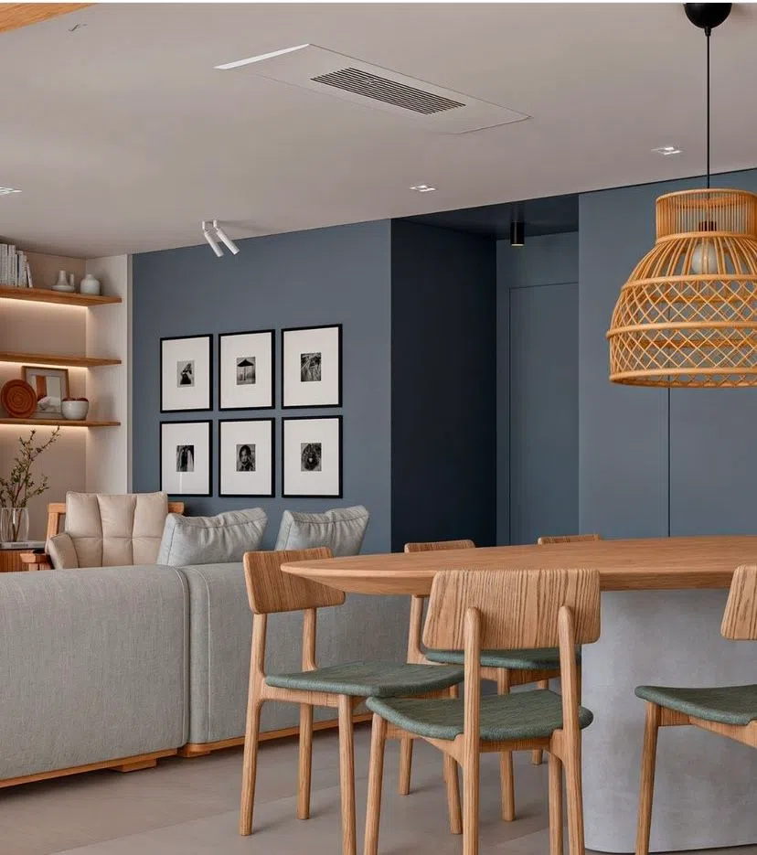
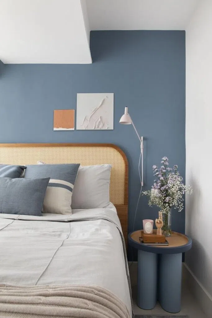
Dirty Blue: The Timeless Scandinavian Trend
A dirty blue A softer, more grayish shade of blue that creates a calm atmosphere and a sense of home. This shade works particularly well when paired with light wood, neutral materials, and natural tones.
It's not a very dominant color, so it's suitable for painting smaller rooms where it's important to maintain an airy feel.
Tried-and-true wall paint codes:
Benjamin Moore | Little Falls 1621
Farrow & Ball | De Nimes 299
Trilak | Seastone PPG10-11
Bright lemon yellow: a defining accent color
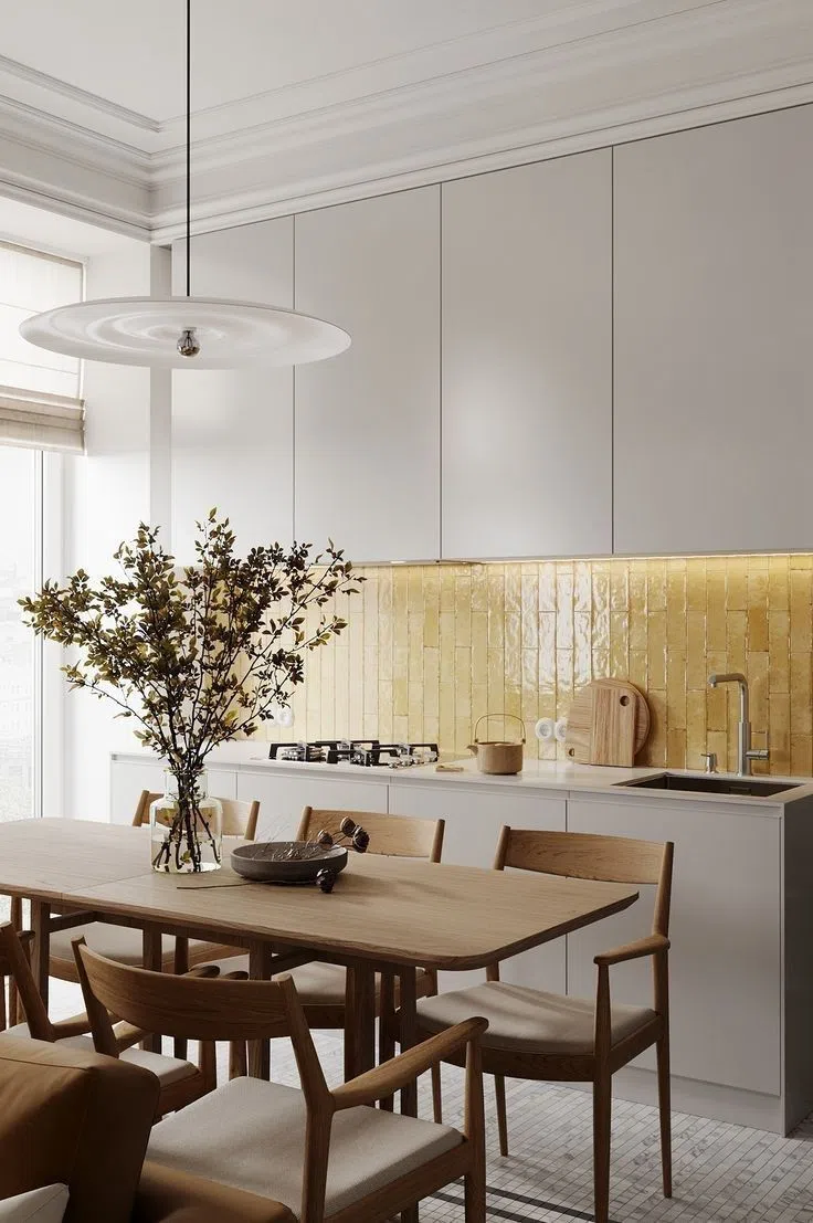
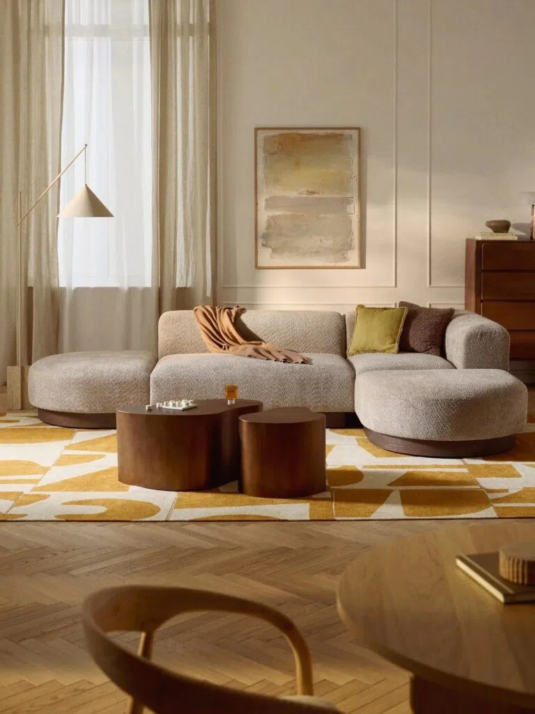
In terms of trends, vibrant lemon yellow is more likely to make a splash as an accent color. Because of its strong impact, it is returning to the design palette not as a dominant wall color, but as an accent shade.
When used in the right proportions, it can add a sense of freshness and liveliness.
How should we choose from among the 2026 wall color trends?
When choosing wall colors, it’s a good idea to consider the room’s function, the amount of natural light, and the other materials used. An experienced interior designer It can be a big help in ensuring that the shade you choose works well in the long run.
A well-chosen color not only provides an aesthetic experience but also creates a genuine sense of comfort in homes.
Summary: What should you keep in mind about wall color trends for 2026?
The wall color trends for 2026 clearly lean toward natural, warm, and cozy hues. In 2026, the goal of interior design is not to create a quick visual impact, but to design timeless, serene, and harmonious spaces. Terracotta, deep greens, burgundy, and subdued pastels all contribute to making our homes true sanctuaries. Well-chosen wall paint and a thoughtfully curated color palette not only follow trends but also add long-term value to our living spaces.
Photo source: Pinterest