Blue is one of the most popular colors in interior design; moreover, it has a calming effect and is extremely versatile.
When choosing a wall color, composing an interior, or creating a specific mood, the various shades of blue provide interior designers with a particularly versatile tool. Scandinavian interior design, modern minimalism, classic styles, and even the Art Deco world all embrace this multifaceted color in different ways, yet with the same sense of naturalness.
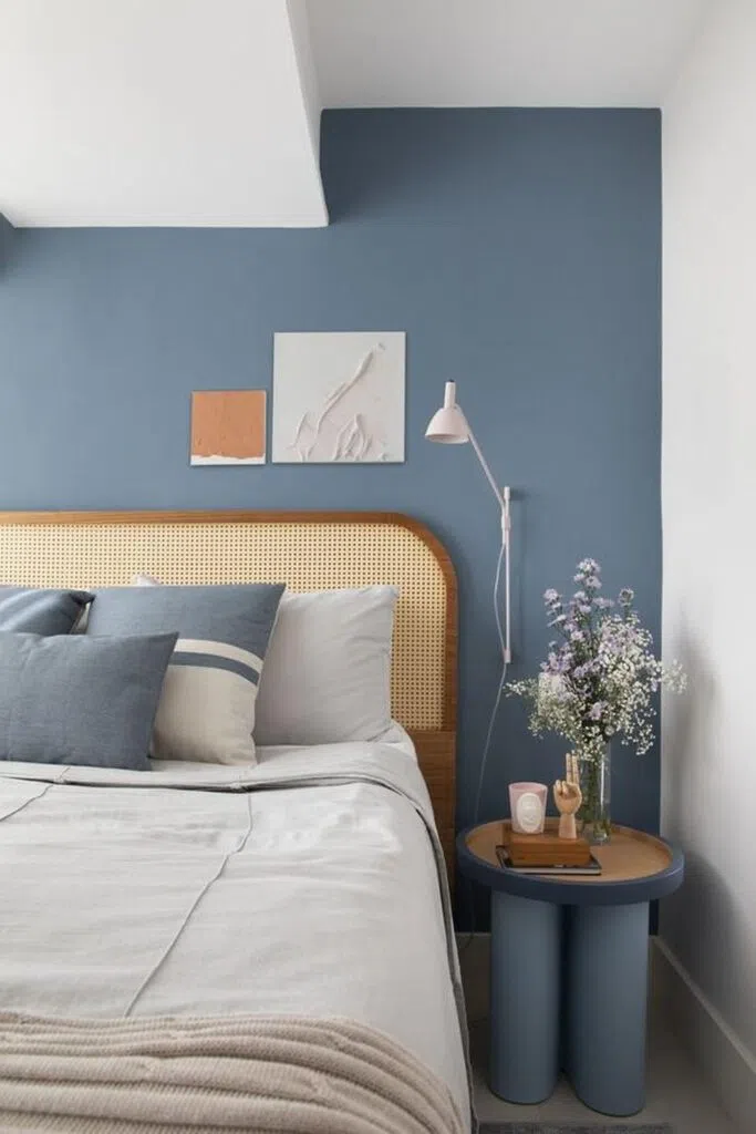
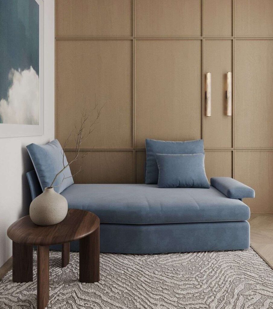
Palakék: The Color of Scandinavian Charm
Palakék is an excellent choice for Scandinavian and modern minimalist interiors, where natural materials and subdued tones dominate. This shade of blue creates a calming, balanced atmosphere and pairs perfectly with light wood surfaces, off-white accessories, or soft textures.
It works well in interior design on larger wall surfaces, but it also looks great on a statement piece of furniture. Its elegant yet understated blue color is exactly what a harmonious Scandinavian space needs.
Tried-and-true blue wall paint codes:
Benjamin Moore | Little Falls 1621
Farrow & Ball | De Nimes 299
Trilak | Seastone PPG10-11
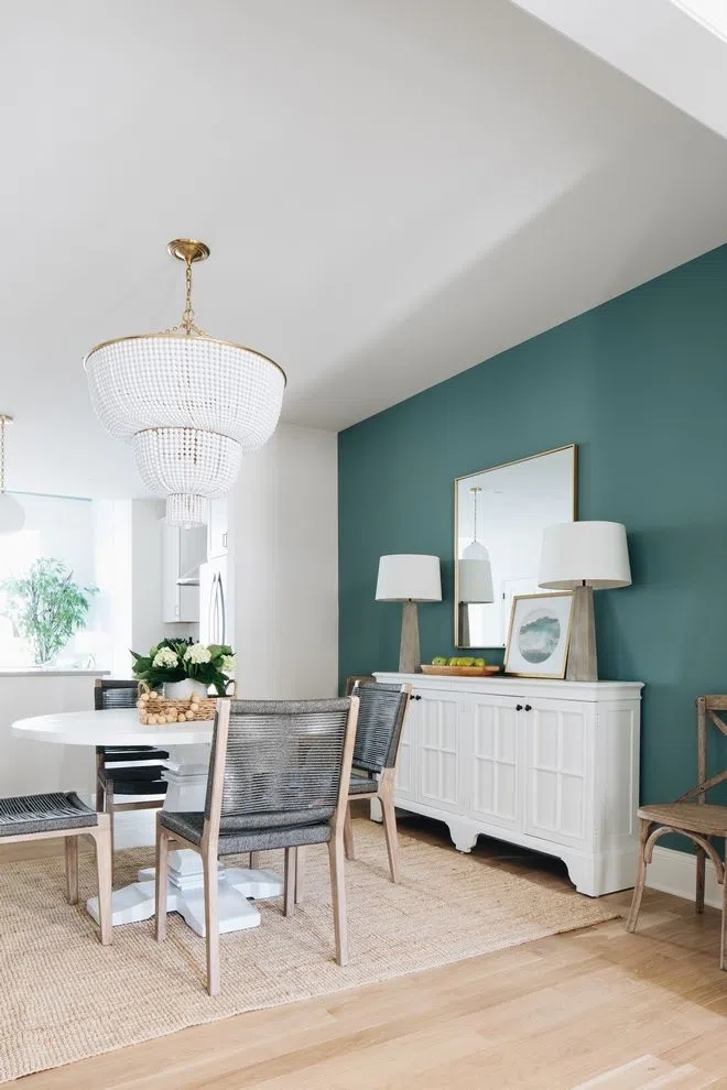
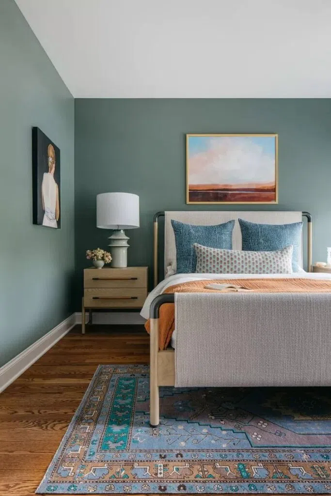
Pastel turquoise: a fresh and vibrant classic
Pastel turquoise is one of the key shades in classic, country, and Scandinavian interior design styles. It is a cheerful yet sophisticated color that brings a sense of freshness to a space without becoming overly dominant.
From an interior designer’s perspective, it is particularly popular in bright spaces, where natural light further enhances the cheerful character of the shade. It’s an excellent choice for textiles, small pieces of furniture, or even as a full wall color.
Tried-and-true blue wall paint codes:
Benjamin Moore | Aegean Teal 2136-40
Farrow & Ball | Oval Room Blue 85
Trilak | Symphony Of Blue PPG1035-4
Indigo Blue: Distinctive and Versatile
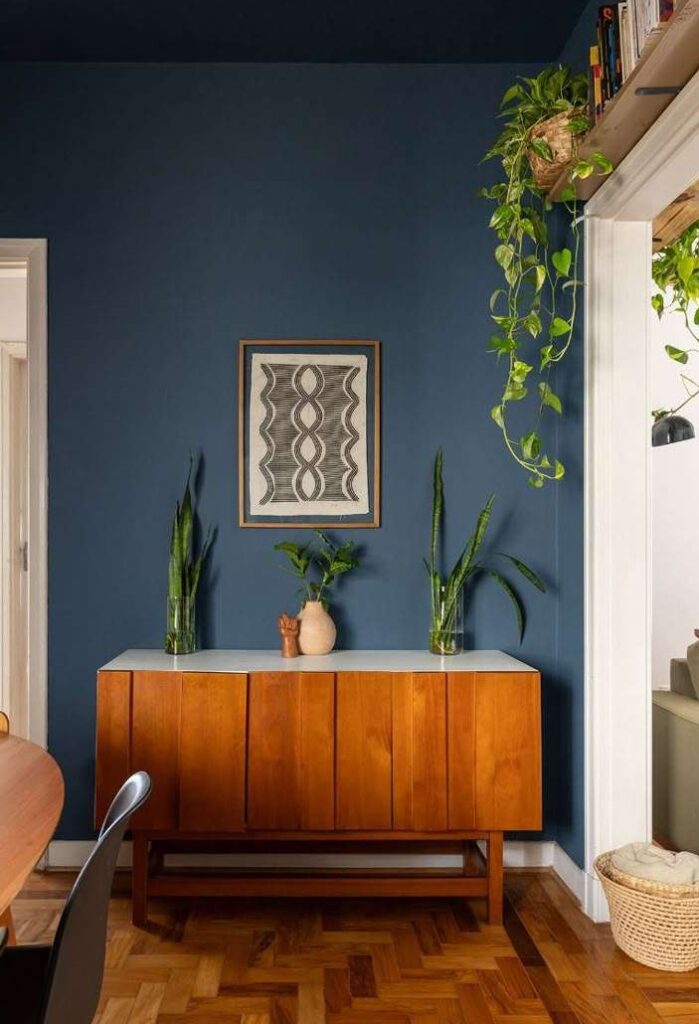
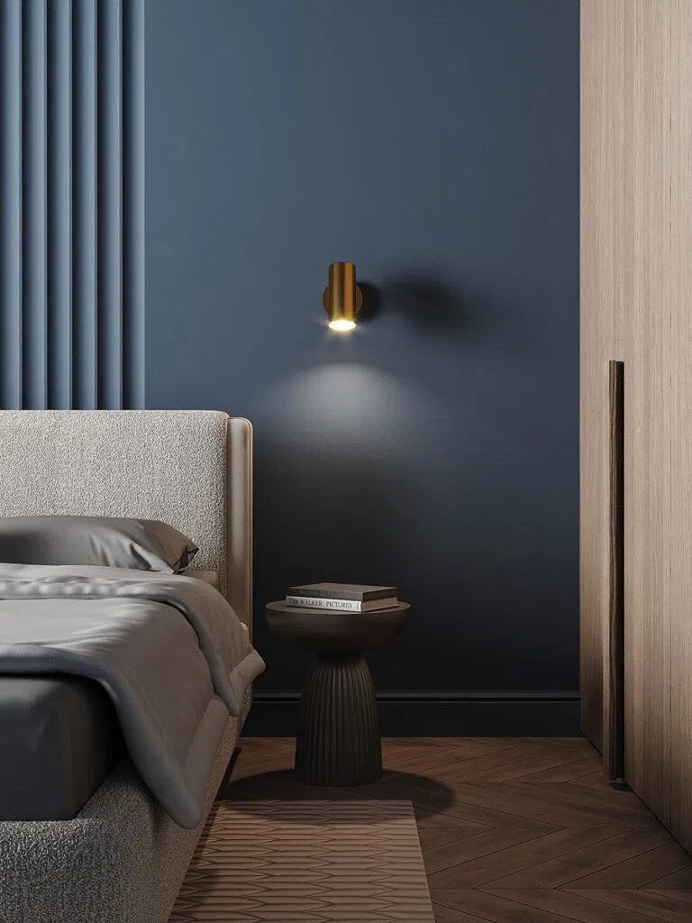
Indigo blue is one of the most distinctive shades of blue, and it works well in mid-century modern, classic, or Scandinavian interiors. It creates a unique, slightly mystical mood, and its strong presence immediately defines the atmosphere of a space.
In interior design, we often use it in spaces where we want to create a special, more intimate atmosphere—such as in a reading nook, a bedroom, or on an accent wall. Wood, brass, and textured materials harmonize particularly well with it.
Tried-and-true blue wall paint codes:
Benjamin Moore | Indi Go-go CSP-565
Farrow & Ball | Stiffkey Blue 281
Trilak | Blue Lava PPG1155-7
Pale baby blue: fresh and airy
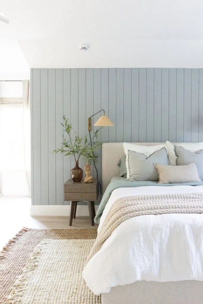
Pale baby blue is an airy, fresh, and clean shade that works wonderfully in Scandinavian, vintage, or bohemian interior designs.
This shade of blue is ideal for smaller rooms or spaces where you want to create a bright, airy feel. Natural fabrics, light wood, and soft pastel accessories complement this shade particularly well.
Tried-and-true blue wall paint codes:
Benjamin Moore | Ocean Air 2123-50
Farrow & Ball | Skylight 205
Trilak | Blue Smoke PPG1153-3

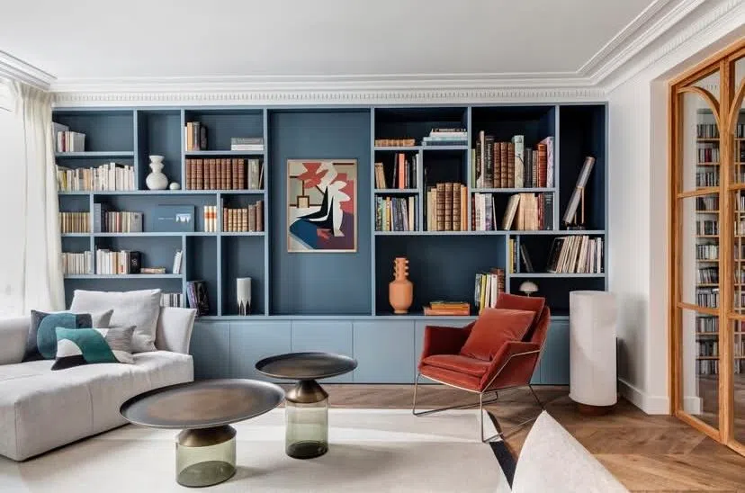
Midnight Blue: Instant Elegance
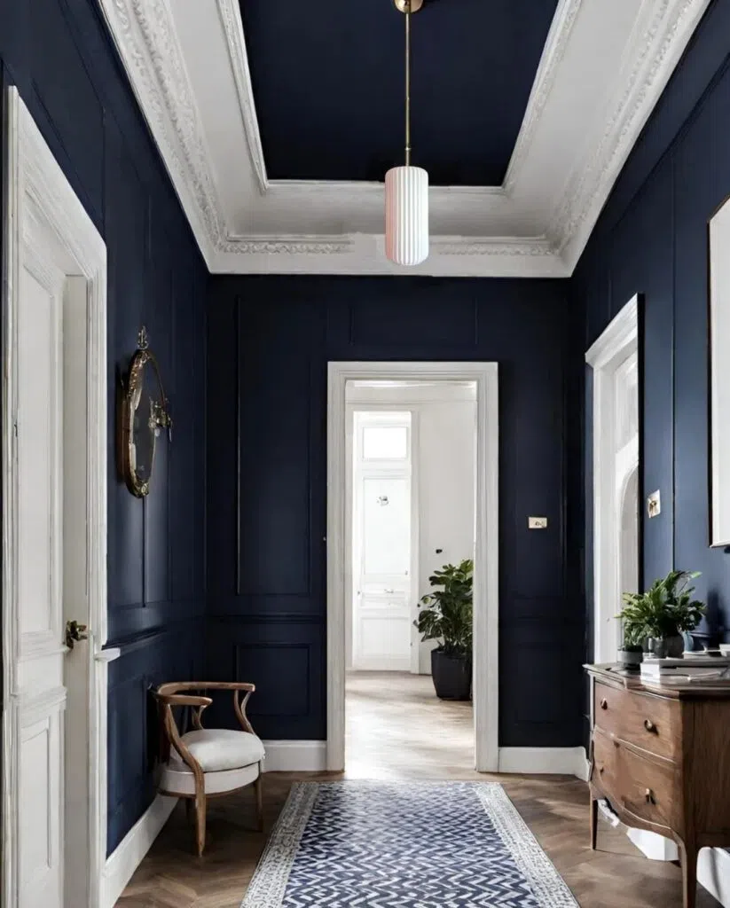
Midnight blue is a rich, deep shade with a luxurious feel, perfect for both elegant and upper-class spaces, as well as Art Deco or classic interiors.
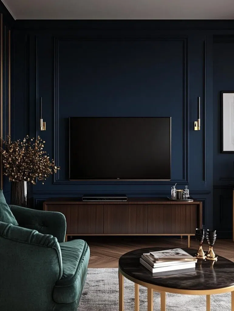
It can be used as a dramatic yet sophisticated wall color that adds depth to a space and provides a wonderful backdrop for works of art, metallic accessories, or velvety textiles.
From an interior design perspective, midnight blue is one of the most beautiful pairings with shades of copper, bronze, and gold, as together they create a truly luxurious experience.
Tried-and-true blue wall paint codes:
Benjamin Moore | Deep Royal 2061-10
Farrow & Ball | Hague Blue 30
Trilak | Sailor’s Coat PPG1153-7
In interior design, the versatility of the color blue lies in its ability to simultaneously soothe, add depth, create emphasis, or lend a fresh, cheerful atmosphere. Choosing the right shade is one of the keys to design, whether it’s a modern, minimalist home, Scandinavian simplicity, classic elegance, or a bohemian style playfulness.
Timelessness is inherent in every shade of blue, as it pairs well with neutral palettes, white, gray, beige, or pink. In fact, it can even subtly balance out bolder colors, such as red or mustard yellow.
Photo source: Pinterest