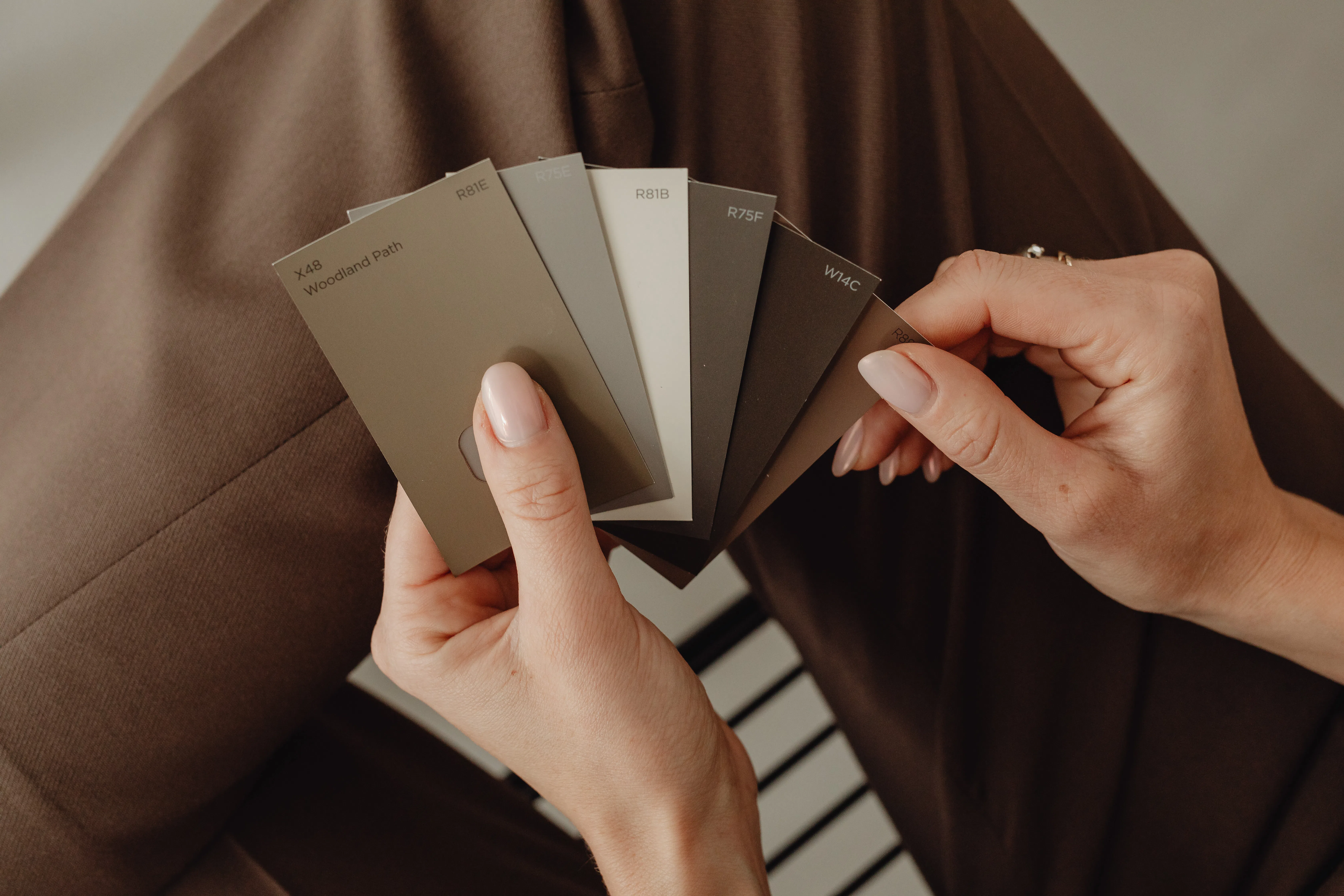
Beige is one of the safest yet most versatile wall colors in both modern and classic interior design. Many people initially find it boring, but the thoughtful use of neutral shades can create a sophisticated, harmonious, and truly cozy interior.

In this blog post, I’ll show you how beige and gray wall colors can become true interior design tools, when each shade is the ideal choice, what kind of atmosphere a particular color creates, and which colors they pair well with.
If you'd rather watch a short video right now, click on our related video:
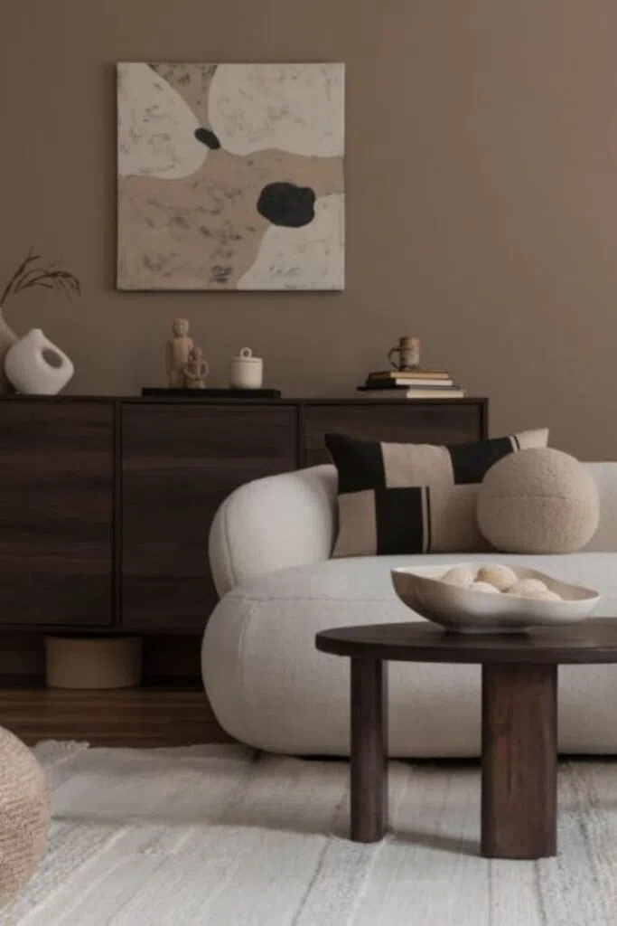
Hazelnut brown: the color of classic style
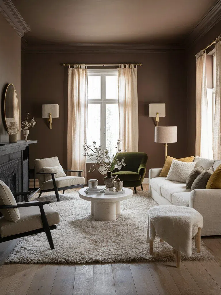
Hazelnut brown is a warm, cozy, and natural-looking neutral shade of dark beige and brown that provides an excellent foundation for classic, vintage, or even Japandi interiors.
By varying the accent colors, we can create different moods. It pairs well with off-white, olive green, or terracotta. These color combinations create a subtle contrast while preserving the space’s unity and warmth.
Tried-and-true wall paint codes:
Benjamin Moore | Whitall Brown HC-69
Hera | Chocolate Mousse
Trilak | Ranch Mink PPG1075-5
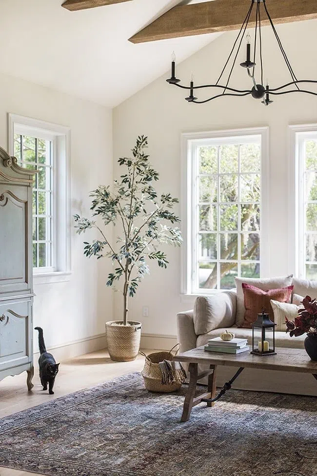
Pearl Beige: The Timeless Beige Wall Color
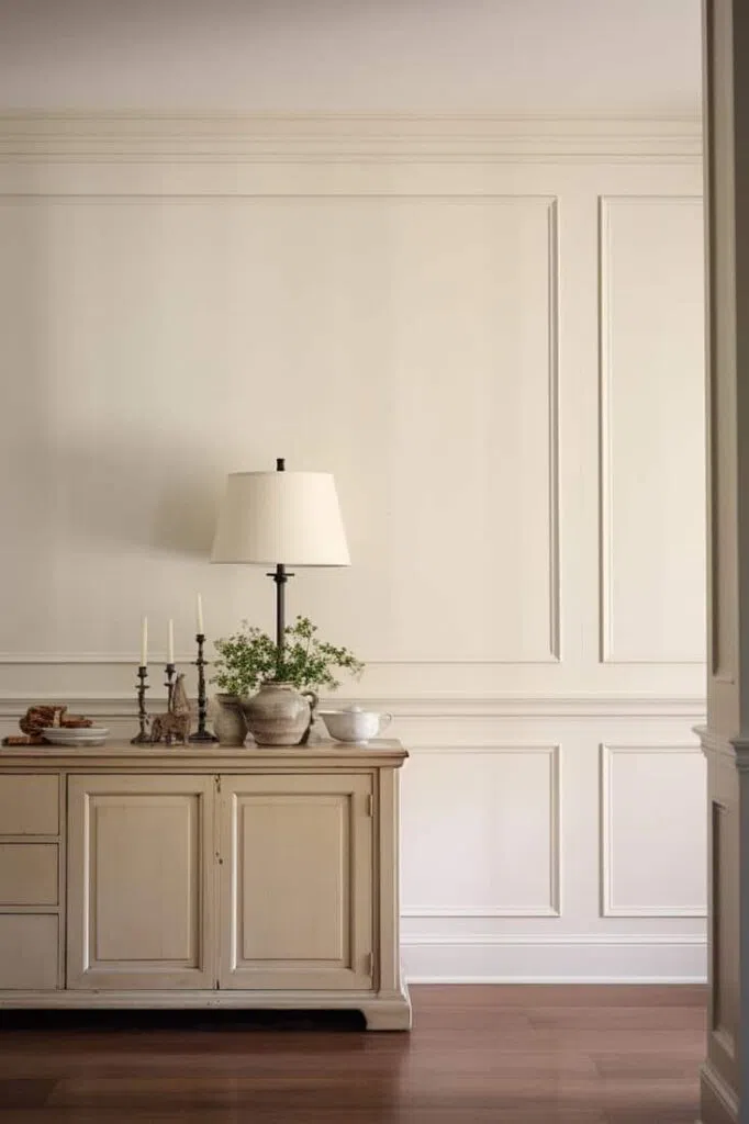
Pearl beige is a delicate, timeless, and light shade that looks particularly good in romantic and classic interiors. It’s a soft and elegant base that can be used to create an intimate and cozy atmosphere while preserving the room’s airiness.
It pairs beautifully with powder pink, gold accents, or light gray. By using different complementary tones, you can create a variety of interiors with a pearl beige base.
Tried-and-true wall paint codes:
Benjamin Moore | Strand Of Pearls CSP-395
Farrow & Ball | Dimity 2008
Trilak | Lonely Cloud PPG1078-2
Dove Gray: the perfect blend of gray and beige
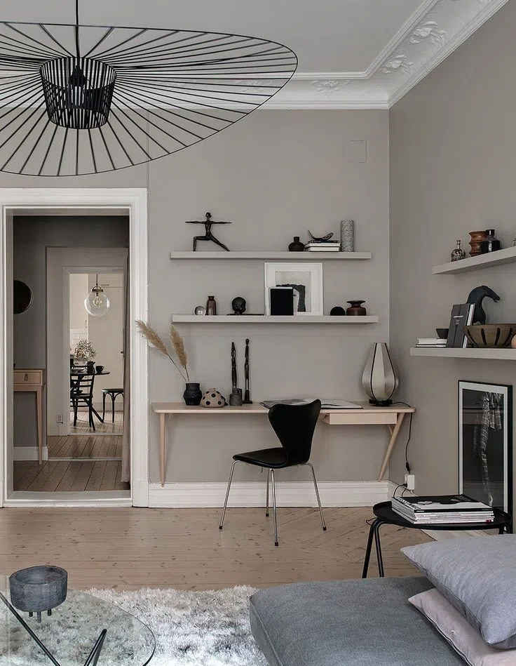
Pigeon Gray is a soft, subtly warm shade of taupe that’s the perfect choice for classic, Scandinavian, and even minimalist spaces. It creates a subdued, harmonious atmosphere that works well with both light and dark wood furniture.
Earth tones go perfectly with it, as do brighter turquoise hues and cool shades. When combined with vibrant colors, it creates a particularly dynamic effect. For a cozier look, it’s a good idea to choose accessories in warmer shades.
Tried-and-true wall paint codes:
Farrow & Ball | Dove Tale 267
Benjamin Moore | Thunder AF-685
Trilak | Floating Veil PPG1022-3
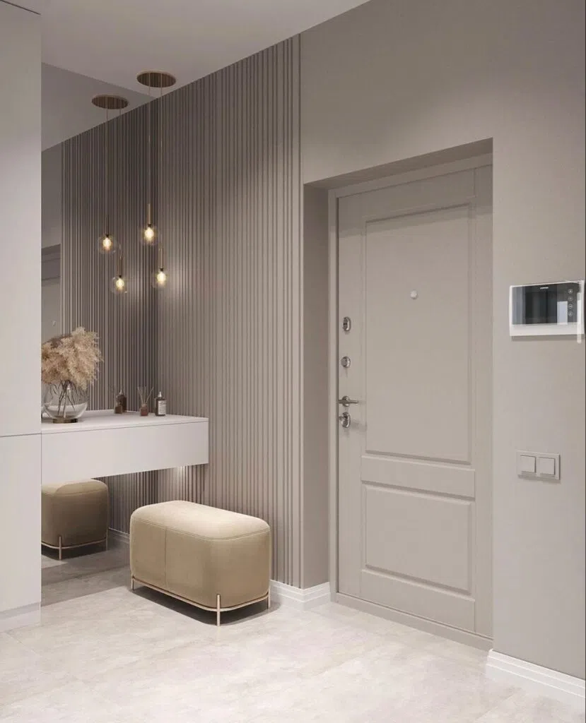
Kubanit Gray: adds a bold sense of depth to the space
Kubanite gray is a more distinctive, slightly warmer shade of gray that can serve as an excellent base in modern, Japandi, and minimalist spaces. Although it may seem dark at first glance, its depth actually lends a sense of coziness to the space. By pairing it with unique decor, soft wool textures, and lighter neutral colors, you can create a harmonious and inviting interior.
The Kubanite gray color pairs particularly well with black, anthracite, or even deep petrol blue, creating a bold yet elegant home.
Tried-and-true wall paint codes:
Benjamin Moore | Coachman's Cape CSP-90
Farrow & Ball | London Clay 244
Trilak | Deconstruction PPG1006-6
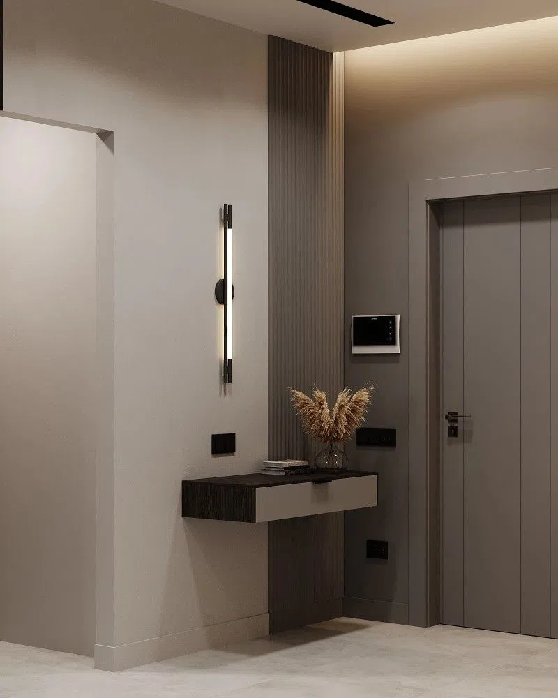
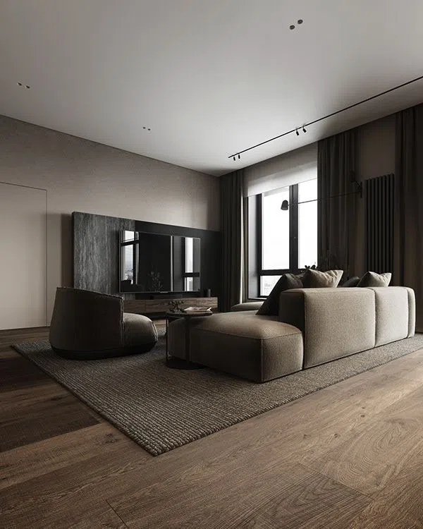
Grayish beige: the most popular color
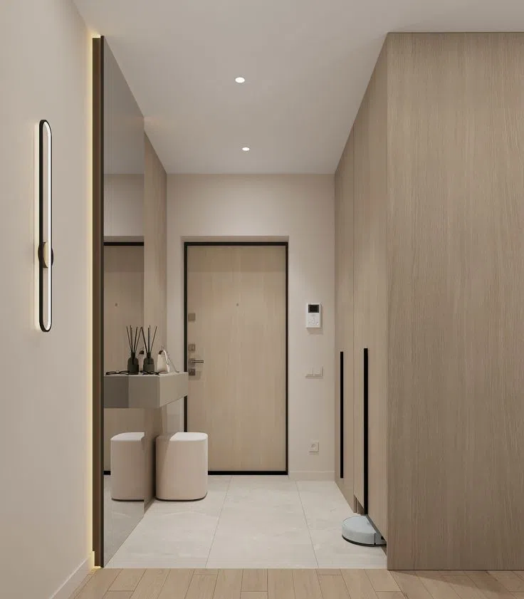
Grayish beige is one of the most versatile shades of beige. It’s a modern, clean-lined neutral that can be adapted to almost any style. Because of its understated presence, it’s the ideal choice when you’d rather use furniture and decor to add emphasis and contrast to a space. It can also be a great choice for smaller rooms.
When combined with shades of dark brown, graphite, or deep burgundy, we can achieve a dynamic effect while keeping the space balanced and cozy.
Tried-and-true wall paint codes:
Dulux | Master Canvas
Farrow & Ball | Elephant's Breath 229
Trilak | Intuitive PPG1022-2
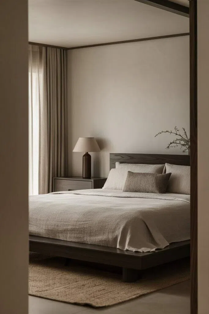
Basic White: The Perfect Neutral Color
Choosing the right shade of white is particularly important from an interior design perspective. White makes a space appear larger and creates a sense of freshness and order.
RAL 9003 pairs beautifully with almost any color and a variety of shades.
Tried-and-true wall paint codes:
RAL | 9003 Signal White
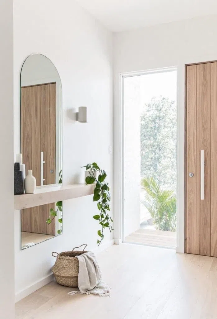
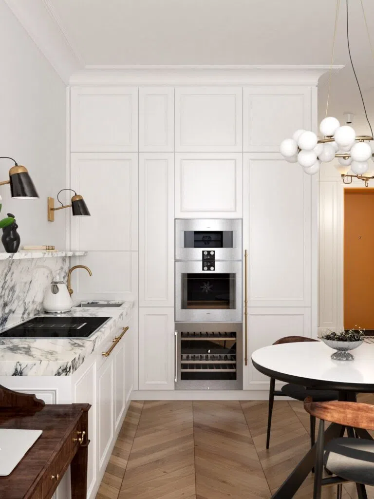
In interior design, beige is one of the most popular and versatile neutral colors, as it can simultaneously create a sense of calm, elegance, and timeless harmony. Choosing the right neutral color is key to selecting a wall color, because a well-chosen shade subtly shapes the mood of a space and creates a pleasant, balanced atmosphere. Whether you opt for a lighter or deeper tone, neutral grayish-beige shades provide a stable, soothing foundation in any interior.
One of the biggest advantages of using neutral colors is that they can be combined with almost any color, whether it's terracotta, yellow, green, or shades of blue. Neutral-colored walls provide an excellent backdrop for more striking furniture and wall art in interior spaces. Beige color combinations in interior design are by no means garish, yet they create a subtly distinctive effect. The use of neutral tones helps create a timeless and stylish home.
Photo source: Pinterest