The color green is extremely versatile in in interior design, as it is a natural, soothing, yet distinctive shade. If we want to achieve a fresh, cozy, or timelessly elegant look in our home, choosing green for the walls is one of the best decisions we can make. Green walls not only add character to a space but are also a beneficial choice due to the psychological properties of the color green. Green wall colors create a calming atmosphere, have been proven to reduce stress, and provide a natural, nature-inspired ambiance.

In this guide, I’ll introduce my five favorite shades of green for walls and explain how to use them in different interiors. Since different shades of a single color can create completely different moods, when choosing a green wall color, it’s important to consider lighting conditions, furniture, and even the emotional effect you’re aiming for. It’s important to know that even the slightest difference in shade can evoke different emotions in us. Color selection is therefore important not only from an aesthetic standpoint but also because of its psychological effects.
If you'd rather watch a short video right now, click on our related video:
Green walls, therefore, serve not only a decorative purpose but also play a real role in setting the mood. Green walls can be complemented with other shades, textiles, and natural materials, which create a truly harmonious atmosphere.
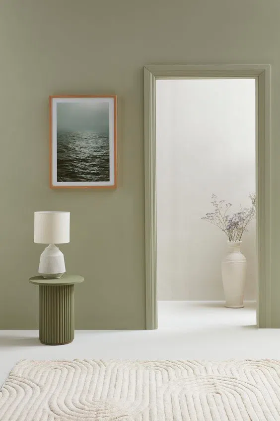
Sage Green: Soft and Understated Elegance
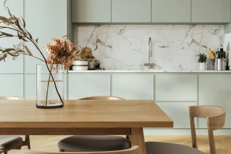
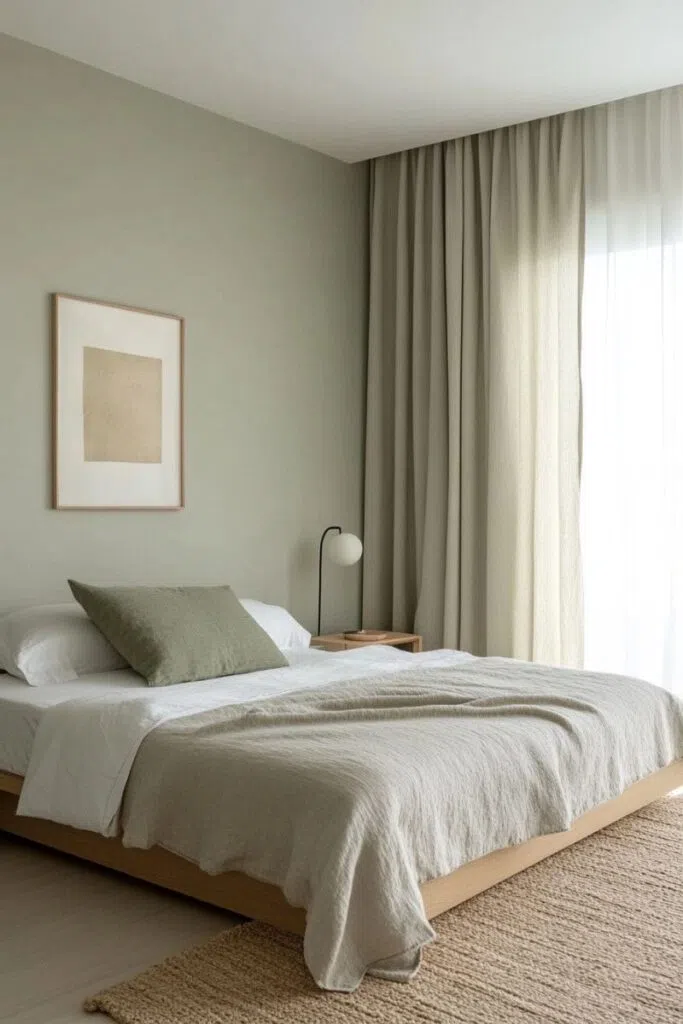
Sage green is one of the most versatile shades, blending subtly into a space and creating timeless harmony. Because of its grayish undertone, this shade is particularly well-suited for Scandinavian, Japandi, or classic interiors where a clean, uncluttered look is important. Sage green—also known as mint green—is the perfect choice for spaces that require a color that works well even under artificial lighting.
It falls into the category of light pastel green shades, so it works well in both small and large spaces. Light greens make a space appear larger and create a fresh, balanced atmosphere. When used in this way, green works particularly well with white or gray furniture, natural textures, and natural fabrics such as linen or cotton.
Among green hues, sage is particularly soothing, making it an ideal choice for bedrooms, living rooms, and dining rooms. Since it’s a soft shade among wall colors, it complements many different styles and pairs effortlessly with wooden furniture or minimalist stone surfaces. Decorative elements such as houseplants, ceramics, and natural textiles further enhance this harmonious effect. This shade works well in any space where the goal is to create a beautiful, green, understated, and cozy atmosphere.
Tried-and-true green wall paint codes:
Benjamin Moore | Vale Mist 1494
Farrow & Ball | Vert De Terre 234
Trilak | With A Twist PPG1028-2
Olive green: natural and timeless depth
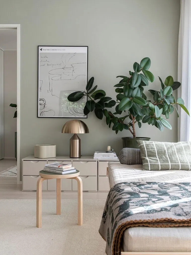
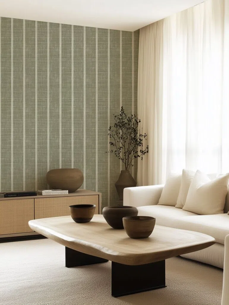
Olive green is a shade with a particularly warm tone, making it a favorite in Mediterranean and nature-inspired interiors. For example, it creates a beautiful harmony and warmth when paired with wooden furniture in interior design, and it’s also ideal alongside stone surfaces—such as limestone and travertine—as well as rattan and jute textures.
This shade of green works particularly well in classic, modern farmhouse, or Mediterranean interiors. It pairs beautifully with white, brown, or gray furniture and is a great fit for spaces where you want to achieve a natural look without green being the dominant color. Green complements natural materials well and is a perfect choice for living rooms or dining rooms.
Tried-and-true green wall paint codes:
Benjamin Moore | In The Garden CSP-805
Farrow & Ball | Lichen 19
Trilak | San Pedro PPG1031-4
Pine Green: an elegant, deep shade
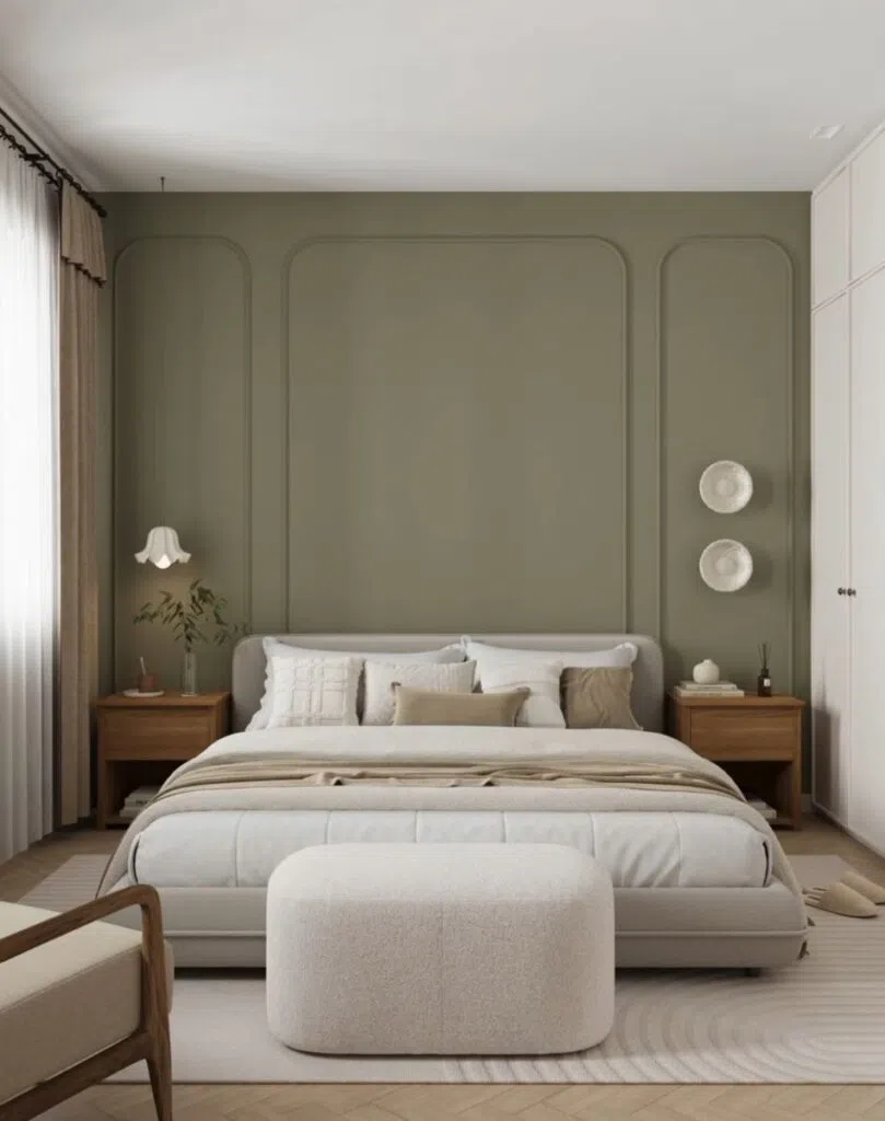
Pine green, also known as forest green, is a rich, deep shade that lends a strong character to any space. Dark green walls in this pine shade exude a sense of depth and serve as an excellent backdrop for rooms with a more intimate atmosphere, such as a bedroom, a home office, or a reading nook.
The unique power of pine green lies in its ability to lend elegance and depth to a space, creating a visually rich yet serene atmosphere. If you want to achieve a sophisticated yet natural look, this color is the ideal choice.
Tried-and-true green wall paint codes:
Benjamin Moore | Jack Pine 692
Farrow & Ball | Green Smoke 47
Trilak | Dwarf Spruce PPG1136-6
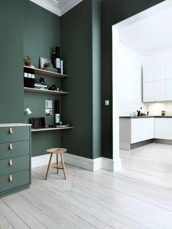
Pistachio Green: Fresh and Energetic
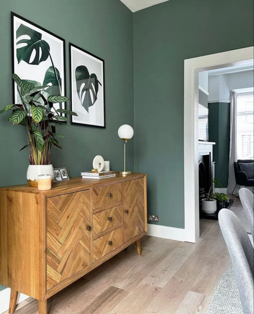
Pistachio green is a fresh, spring-like, light shade—one of the most inviting among light green hues. This shade blends beautifully into vintage, retro, romantic, or Scandinavian-style spaces. Both light and dark furniture, as well as rattan and natural wood, pair perfectly with green walls and help create a space that feels airy, open, and inviting.
Pistachio green is a good choice when you want to highlight the subtle playfulness of green tones on a small surface, such as the fabric of an armchair, a recessed wall niche, or the back of a shelving unit.
Tried-and-true green wall paint codes:
Benjamin Moore | Gregorian Green HC-115
Farrow & Ball | Ball Green 75
Trilak | Green Grey Mist PPG1113-4
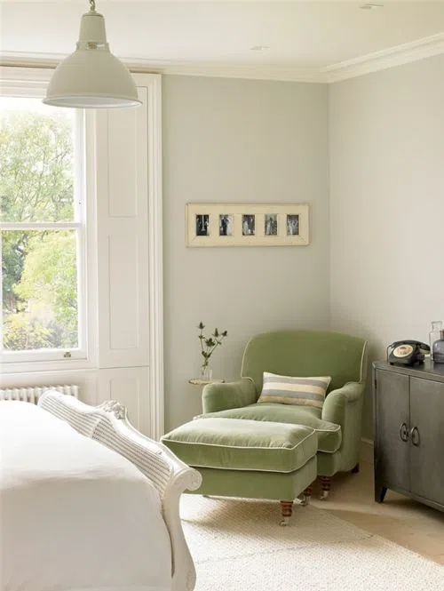
Vivid green: dramatic and distinctive
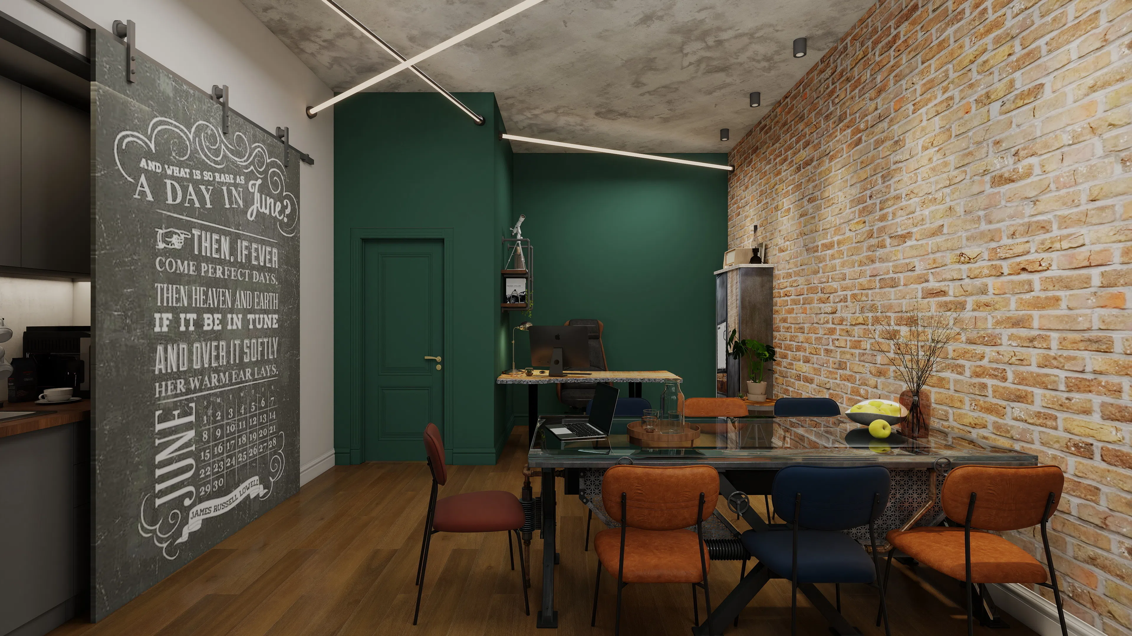
Vivid green is one of the most exciting and boldest shades of green for walls. Its dark, deep, rich tone makes it a truly dramatic element that modern, industrial, and Art Deco a regular feature of interiors.
Walls or furniture in vibrant poison green pair especially well with metallic surfaces, glass, dark wood tones, and elegant lighting. If you’re looking for a shade that exudes boldness and uniqueness, bright green is the ideal choice.
When choosing this wall color, it’s worth keeping in mind that, due to the depth of this shade, it absorbs a great deal of light, so it’s especially important that the room have good lighting. With the right lighting, you can achieve an incredibly elegant result.
Tried-and-true green wall paint codes:
Benjamin Moore | Essex Green HC-188
Farrow & Ball | Studio Green 93
Trilak | Midnight Clover PPG1138-7
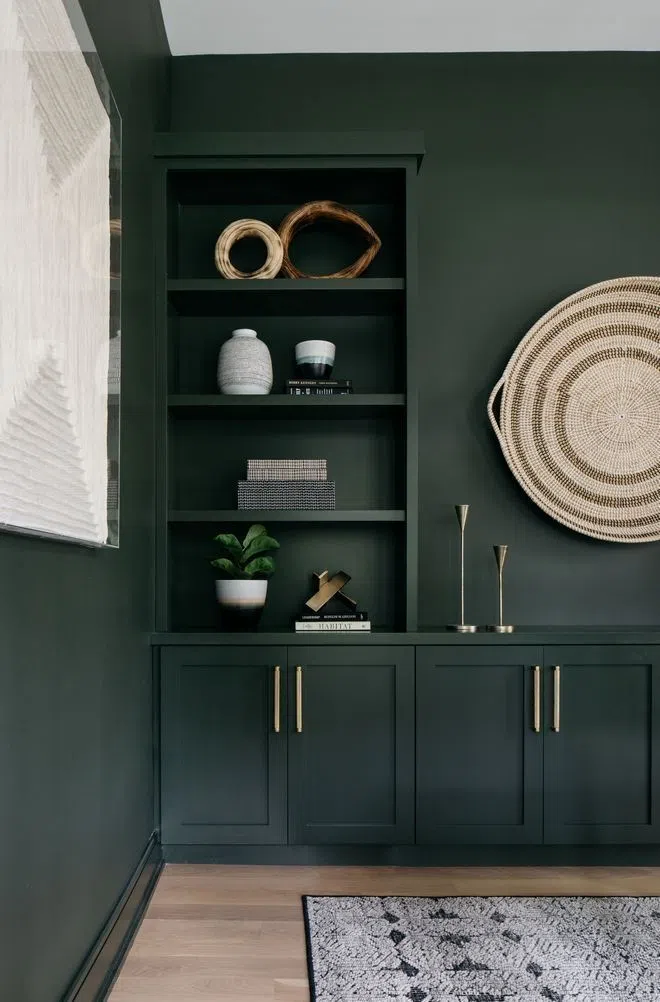
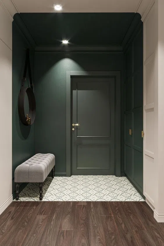
A in interior design The versatility of the color green lies in its ability to simultaneously bring a sense of calm, freshness, closeness to nature, and depth to a space. Choosing the right shade of green is design One of the keys to this is that a soft, pastel tone creates one effect, while a rich, dramatic, deep-green surface creates another. Whether it’s a modern minimalist interior, Scandinavian simplicity, Japandi harmony, vintage charm, or an elegant classic home, the color green can adapt to any style while bringing character and a sense of nature to the space.
Photo source: Pinterest